Multi-faceted campaign for Danssport Vlaanderen
About Danssport Vlaanderen Danssport Vlaanderen is the unisport federation for dance clubs, schools, instructors, and dancers in Flanders. The organization provides support, resources, and a

We all know the feeling: opening your inbox and receiving dozens of newsletters you never have the time to read.
In 2018, I was on a mission to clean up my inbox and unsubscribe from ALL the newsletters I didn’t read at least once the last months.
I have to say it was quite the process and I signed out from dozens of newsletter subscriptions. Along the way, it did help me to discover some creative appraoches.
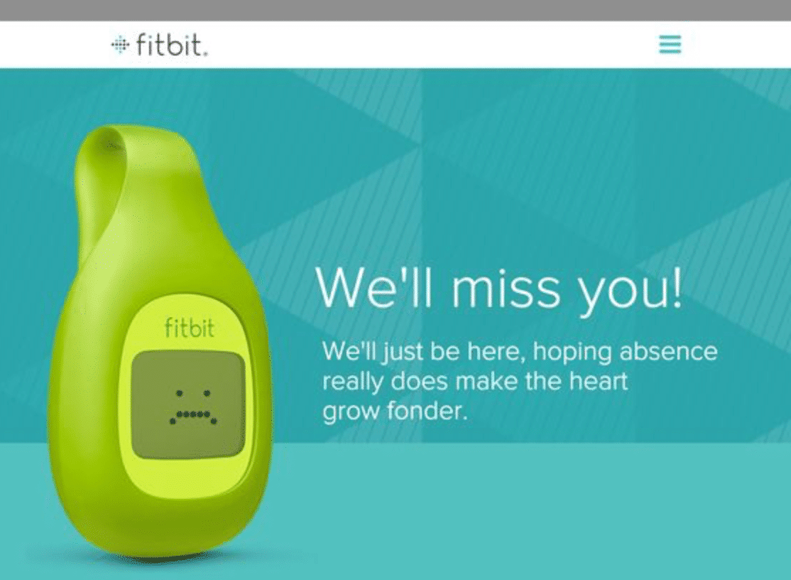
The unsubscribe page I was most impressed with was the one above. It’s from Webs which had the message: ‘we’re sad to see you go’.
I’m betting you’ve seen some similar examples the last years, but at that time I was touched by the message.
Over the years I found some other good – ànd bad – examples for unsubscribe pages, which in my opinion can be divided into different categories:.
Ahh, the angry ex-boyfriend approach. “I so don’t deserve that you’re leaving me but fuck it you’re not giving me another option.”
Used on many sites an in many different ways. Usually requires just one click OR takes you ages to find the way to unsubscribe. Not véry effective I’d say but still the most used tactic out there. Comes in many different variations.
The second type of unsubcribe pages at least do the effort to ask you to indicate the reason you’re canceling the subscription.
I personally find these very annoying because they’ve already lost me on this stage. But kudos for trying to understand why I’m leaving and be better in the future.
Also what I’d call the ‘puppy-eyes’ tactic. Basically you’re signing out and a cute robot, puppy or whatever appears.
Companies here just play on your emotions and try to guilt you into staying.
It’s a cheesy tactic, but I swear that when I first saw that cute Webs robot pop-up, I almost changed my mind and re-subscribed for this newsletter.
I did come to my senses a few seconds later, and realized that there was a reason I was unsubscribing in the first place.
However, when the robot asked me: could you tell me what I’ve done wrong?
I was relieved that I could indicate that the little cutie didn’t do anything wrong, it was really the subject that didn’t suit me anymore.
So the second tactic in combination with an emotional approach díd work for me.
Now we all like personalization and getting options.
And that’s exactly what companies try to do here.
They’re giving you some space to make your own decisions without losing you completely.
Some let you chose to sign in for other topics or to receive the newsletters in a lower frequency.
One company even asked me if I wanted to put the subscription on hold and start receiving them again from a certain moment in time, which suited my situation perfectly.
Now what I felt really makes the difference here is personalization.
Not just giving allowing you to change the frequency, but also which type of content you’re receiving.
‘We see you like this topic most, how about just subscribing for this type of mails.’ Did the trick for me.
Just don’t go too far or it might become creepy.
Back to the Webs example. In the end my cute robot answered: I will miss you, let me know when you change your mind, I will happily welcome you back.
And I couldn’t help but feeling a little touched.
And maybe I didn’t want to receive their newsletter anymore, but they certainly managed to give me a good feeling about their company right before I was leaving.
No way I would say a bad word about it to anyone.
So even a simple unsubscribe page gives you the option to work on your CRM.
Keeping it in mind even when customers are leaving your business. can make a huge difference.

So what category would you say you’re in? Wait no let me start with this: do you even hàve an unsubscribe page set-up? Marketers have so many to-do’s that you might’ve forgotten about this one.
But think about it this way: you’ve done so much work to gather those leads and have them subscribe to your newsletter. Shouldn’t you at least try to keep them with you?
If you do, just remember to address your (soon to be) ex-customers in an emotional way, suggest other, personalized subscriptions and welcome them back if they still try to leave.
P.S. Don’t forget to be original. If everyone would start using a cute puppy to play on my emotions, I doubt it would have the same effect. 😉
We don’t have time to spam you 🙂 We’ll just send useful tips & trics, case studies from previous projects & free templates, promise!


About Danssport Vlaanderen Danssport Vlaanderen is the unisport federation for dance clubs, schools, instructors, and dancers in Flanders. The organization provides support, resources, and a

About Fros Fros Multisport Vlaanderen is a sports federation dedicated to promoting accessible, fun, and recreational sports for everyone, regardless of age, gender, or fitness

About Lotto Dstny Lotto Dstny, the world’s oldest professional cycling team, has been a cornerstone of the cycling world since 1985. Over the decades, the

About Decca Decca Cycling Apparel is a Belgian brand with a rich heritage in crafting high-quality, custom-made sportswear. While its roots lie in cycling and
