Q

As a Marketing and Communication Manager at Decathlon, we wanted to create a brand identity for Korok and Dita, two hockey brands of Decathlon. We contacted MySueno with this specific question and they produced an original and personalized offer for both brands. We were able to work efficiently, with great quality, in co-creation, with attention to detail, the necessary amount of flexibility, and a perfect follow-up. I will certainly work with MySueno again in the future and I highly recommend other companies to do so too.

Leentje Van Meirhaeghe

Marketing and communication manager Korok & Dita

Korok & Dita Branding

Client
Decathlon
Date
2021

Services

Brand strategy
Brand design
Marketing & Communication

SEO & SEA
Social Media
PR
Ongoing Support

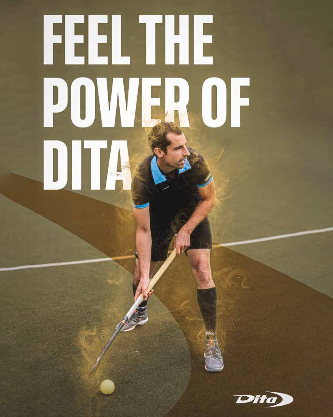
After Decathlon acquired the field hockey brand Dita in 2019, the fusion with their own field hockey brand Korok led to the interesting exercise of figuring out how to position both brands into the market.

Our Challenge?
Figuring out the brand strategy and identity for both brands to obtain as much market share as possible of the current #3 most popular sport in the world.

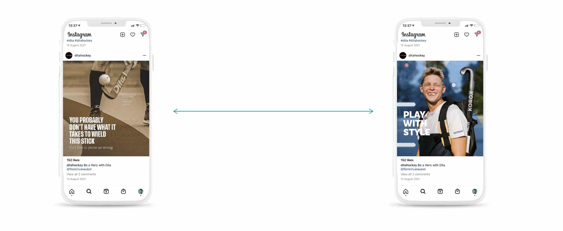
The goal was to create 2 brands that didn’t conflict with each other and appeal to 2 different target audiences within the field hockey world.

Both brands are active all around the world so their strategy and identity needs clear guidelines that are easily followed and implemented.

Discover how we tackled this challenge below.
Our approach

Brand Core
First things first, we started off getting to the core of both field hockey brands, trying to understand what drives each brand and why people should care about them. Afterward, both brands were placed on opposite sides of a relevant market positioning spectrum. We then created a set of strong, actionable, and bold values for both brands to live by.

Brand Positioning
We defined a perfect customer for both brands, going further than simply looking at demographics. These people were defined based on personality, psychographics, fears, and desires so we can play into these characteristics with our identity. Other field hockey brands were carefully researched to come up with a set of unique differentiators for Korok and Dita to focus on.

Brand Personality
For our target audience to truly connect with the brands, we created a personality for Korok & Dita. A personality based on brand archetypes allows people to tap into their pre-programmed instincts and get a clear understanding of what type of brand they are dealing with. This scientific-based approach allows our clients to create a deep emotional connection with the brand.

Brand Identity
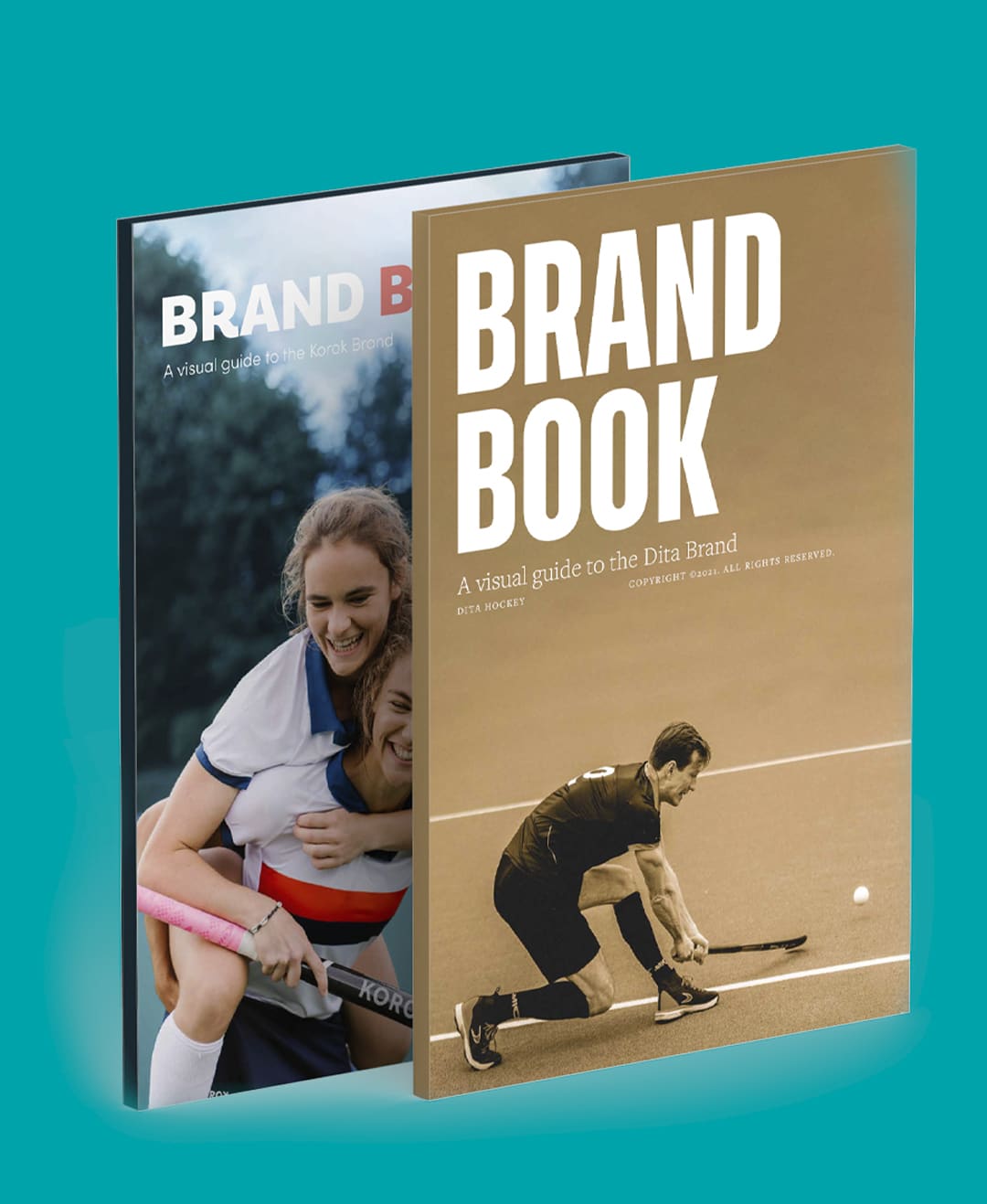
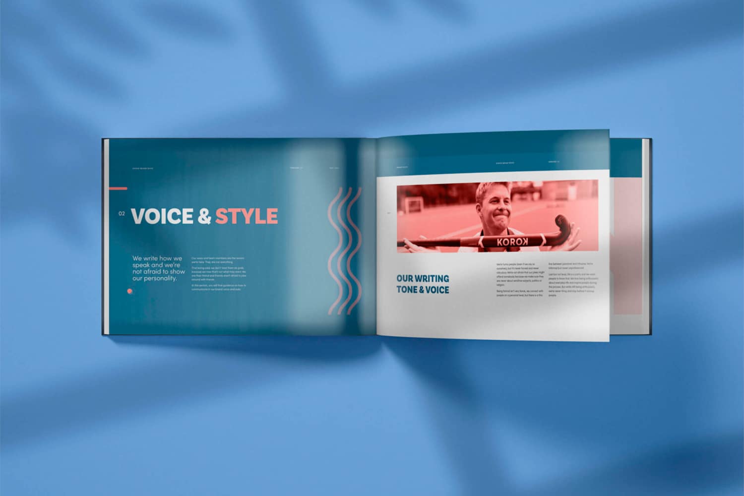
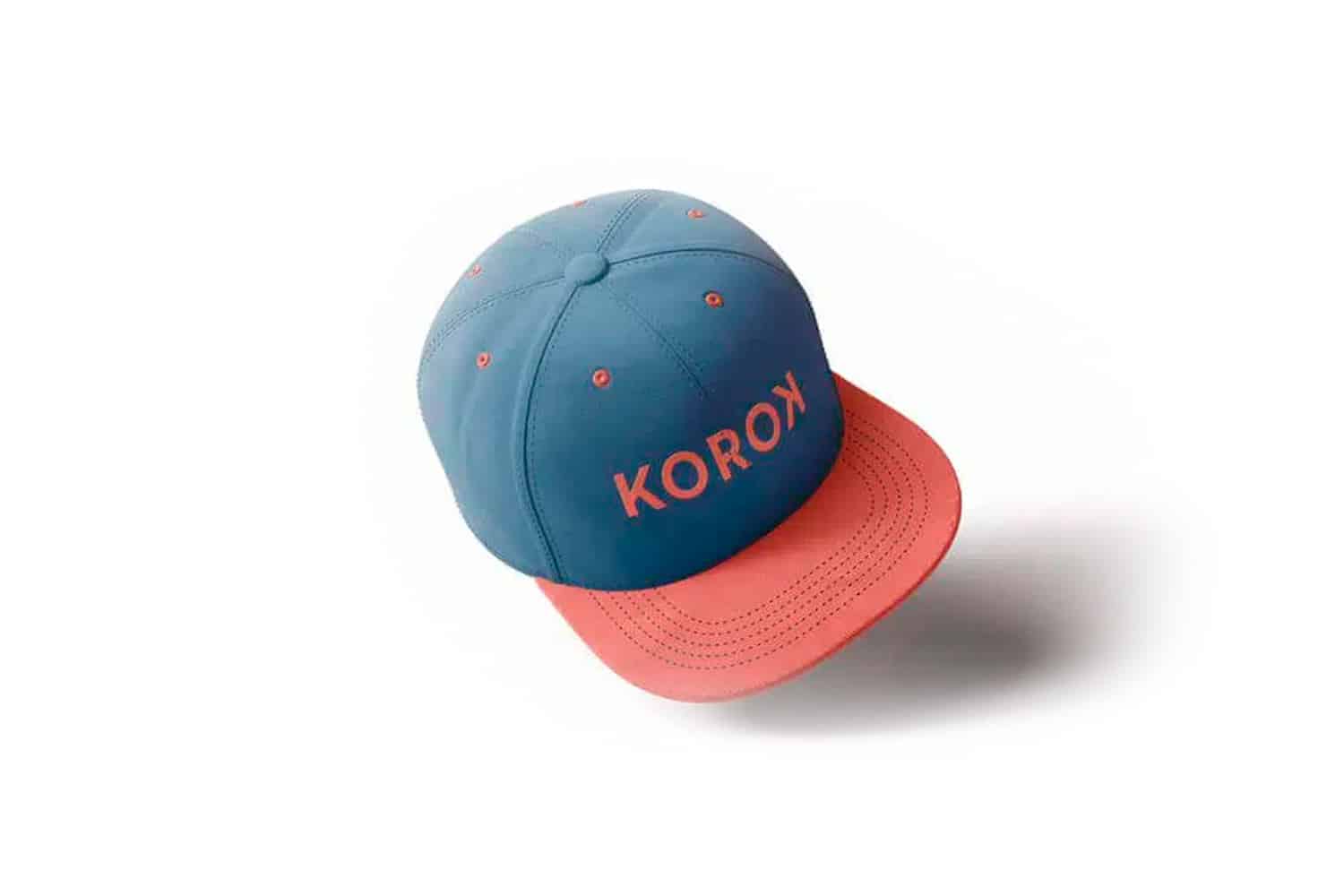
We finally translated all the above information into a clear and effective brand identity. Making sure our visuals, communication style, photography, colors, and typography all reflect what it is Korok & Dita stand for and appeal to our ideal customer. Both brands were given a brand book to create a coordinated, consistent, and effective brand presence.

The results?

Key take-aways

1

Your brand is a person
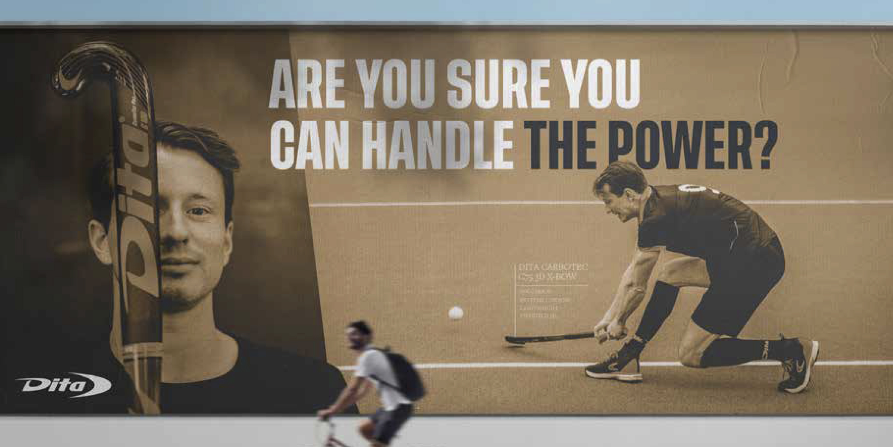
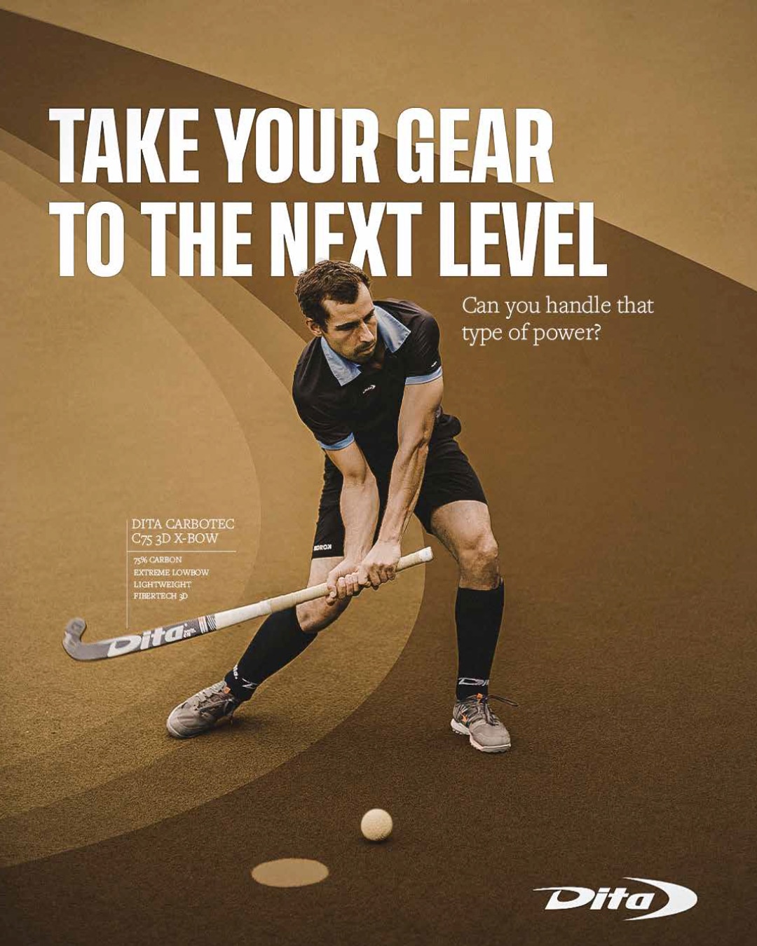
The best brand identities are built with your brand personality and archetype in mind. By knowing which characteristics your brand would have if it was a person, you can align every piece of communication to that personality. This makes your brand feel authentic and builds real emotional connection with the right people. For Dita, we focused on a hero archetype that seeks challenge and aims to be the best. For Korok, the archetype we picked was the Jester who is all about living in the moment and having fun.

1

Your brand is not for everyone
If you want your brand to appeal to everybody, it won’t appeal to anybody. By having 2 brands like Korok & Dita on opposite sides of the spectrum you can target 2 completely different audience types within the field hockey industry. Create a clear and strong message and build upon it each and every day. The positioning map we focused on was performance Fun and Team oriented Individual. Dita is all about individual performance while Korok is all about having fun together.

1

Try out an imagery spectrum
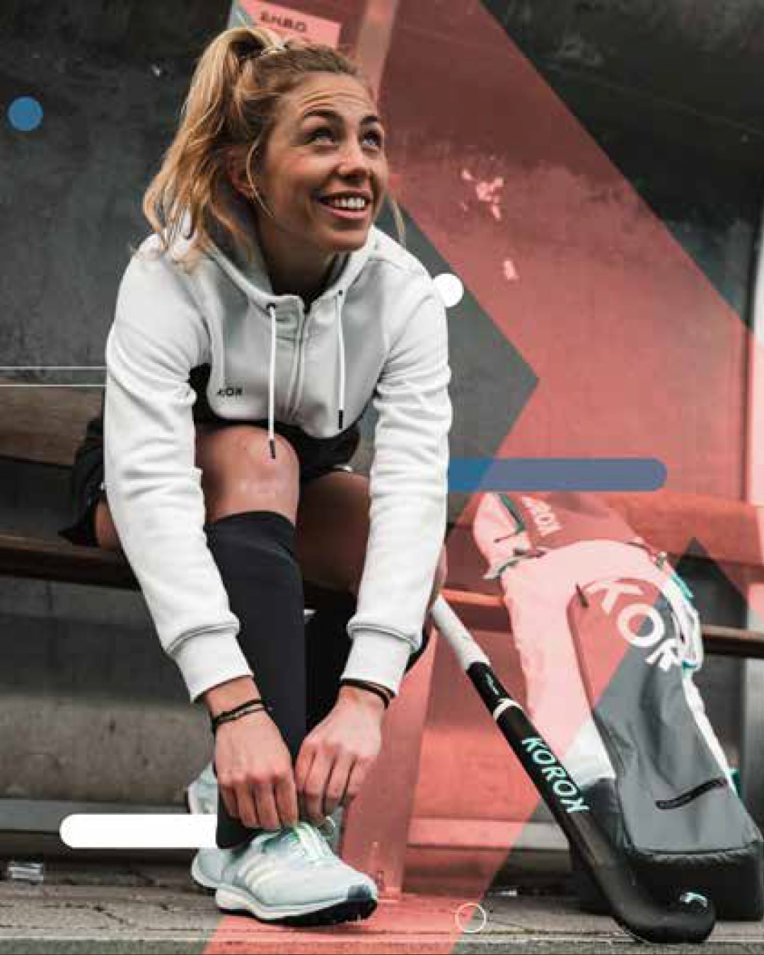
For the Korok brand, we wanted the imagery to feel playful and fun. But there is a thin line between playful and ridiculous. We created a fun – serious imagery spectrum for Korok that came down to this: The way we decide on how many extra brand elements are added to an image is to look at the craziness of that image. The crazier the photography that we use, the less elements we would add and Vice versa. Not every brand needs an imagery spectrum, but it’s important to create guidelines that work for your brand.

What our customer thought

Q

As a Marketing and Communication Manager at Decathlon, we wanted to create a brand identity for Korok and Dita, two hockey brands of Decathlon. We contacted MySueno with this specific question and they produced an original and personalized offer for both brands. We were able to work efficiently, with great quality, in co-creation, with attention to detail, the necessary amount of flexibility, and a perfect follow-up. I will certainly work with MySueno again in the future and I highly recommend other companies to do so too.

Leentje Van Meirhaeghe

Marketing and communication manager Korok & Dita

Let's talk!

Do you have an own project you’d like to discuss? We offer a free strategy call where our consultant will give you advice on the spot and you can get to know how we work.

IMG-julie-circle-1.png

Did you know?

We love guiding people towards their dream. We also love sports, health, ànd coffee.
So if you have an idea or goal you'd like to reach, let us know, and you'll make us happy and let us help you while drinking a (virtual) coffee together! No strings attached!
Select your suitable timeslot or contact us.